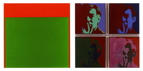
Most of the artists on Greenbergs list were known afterwards as Color Field painters, including Morris Lewis, Frank Stella, Jules Olitski and Helen Frankenthaler. The boundaries were flexible: Greenberg said he considered including Jim Dine and Robert Indiana, but decided against them since "as diverting as Pop art is, I happen not to find it really fresh."49 Some of the painters in the group, like Gene Davis, Ellsworth Kelly. Alexander Liberman and Kenneth Noland, were working with vibrant contrasts of complementary colors, each to different purposes.
Sixties expression required new media, new techniques. "Roy got the hand out of art," the painter Larry Rivers said, "and put the brain in."50 It wasn't only Lichtenstein of course. Around 1962 Abstract Expressionism was on the way out, taking gestural brushwork with it. Pop painters started to stencil the letters, logos and Benday dots on their canvases. (Benday dots are printer's pointillism, relying on the optical mix of dotted colors to create illusions.)
For Anuszkiewicz the transition from freehand to masking tape was like switching from light bulbs to a laser.51 He made the move in selected pictures as 1962 turned into 1963. Exact Quantity of early 1963 still shows his hand on the brush: the red stripes are relatively wide and their edges waver ever so slightly. The look that became Anuszkiewicz's trademark — razor-sharp lines raking across the canvas (or masonite for its superior flatness in small formats) — came to the fore in a frontal assault of high-energy works: Complementary Fission, 1964, Magnetic Force, 1964, Mercurian in the Fire (the cover of Life's international edition, December 28, 1964), and The Edge of All Activity, 1965.52
| Elssworth Kelly, Green Red, private collection, 1964 |
 |
Andy Warhol, Self-Portrait four canvases, private collection, 1966-67 |
Complementary Fission exemplifies, as its title says, a breakthrough made possible by Anuszkiewicz's new technique that placed contrasting lines of complementary colors into what can only be called a 'collision'. Where the green lines converge to a point, the intensity of their contrast with the underlying red field creates a shimmering green tone spilling across the lines. The technical term is 'color film'. Our eyes, and the camera lens — it's a question of resolution — perceive a green aura hovering slightly above the canvas surface, but it does not exist.
